
There’s a wide variety of tools and tactics you can use when making decisions for your business. But here’s the thing: the approaches that help you better process data and put analytics to work lead to the best decisions.
The practice of data analytics is growing more and more prominent in today’s business world, characterized by the proliferation of large amounts of data. Utilizing data analytics allows you to obtain insights into your data, which in turn may assist you in making better choices for your company.
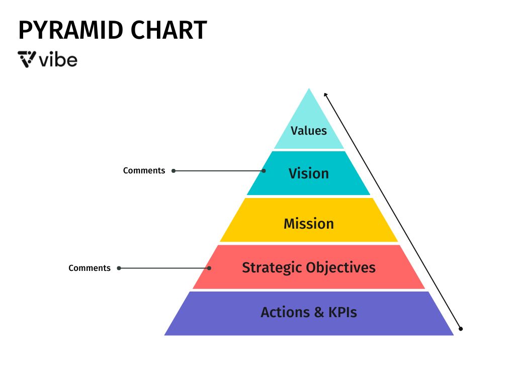
A pyramid chart is an effective tool for analyzing the similarities and differences between sets of data. The data point with the lowest value is represented by the broad base of the pyramid, while the data point with the greatest value is represented by the narrowing apex. This particular chart is perfect for exhibiting the relative size of several data sets as well as presenting information that varies over a period of time.
Let’s break it down.
What Is a Pyramid Chart?

Pyramid charts, also known as triangle diagrams, consist of a triangular chart broken up into horizontal pieces. In a pyramid chart, the data point with the lowest value is represented by the broad base of the pyramid, while the data point with the greatest value is represented by the narrowing apex.
Pyramid charts have been around for quite some time; possibly the most well-known pyramid chart in history is Maslow’s Hierarchy of Needs, which was developed in 1943. This is an example of a straightforward process flow pyramid chart, and it has five distinct levels of demands that one must fulfill before moving on to the subsequent level and, ultimately, realizing one’s potential for self-actualization.
Another great example of a pyramid chart is the food pyramid. Fruits and vegetables are located at the base of the pyramid, followed by carbs and proteins in the middle, and, finally, fats at the top.
A pyramid chart is perfect for exhibiting the relative size of several data sets as well as presenting information that varies over a period of time. It may be used to display hierarchies, proportions, procedures, or simple, unique information.
These charts are also useful tools for illustrating a hierarchy or directed process.
How Do Pyramid Charts Work?

The pyramid chart is often used in presentations for brainstorming a hierarchical structure. One may use it to show:
- Actions made to accomplish a goal, such as collecting and analyzing relevant data for use in decision-making
- Direct quantitative information such as market share, sales, or investment volume
- Jobs at the top ranks of a company or other structured organizations
A sales and marketing pyramid chart often works something like this:
- Spending time looking into possible solutions and doing your research
- Prioritizing the client’s needs and wants
- Choosing your methods for dealing with them strategically
- Using leads to raise brand awareness.
- Successfully generating potential customers’ interest
- Fostering progress
- Developing a base of new customers
- Maintaining repeat clients
What Are Pyramid Charts Used For?

There are many variations of the pyramid chart, but its primary purpose is to present facts in a hierarchical structure. The most typical presentation is an inverted pyramid, which places the most important piece of information at the base and the least amount of information at the peak.
This type is intended to illustrate the proportional relationships between the many parts that make up the whole. Other forms of pyramid charts are the symmetrical pyramid, which presents the information in two halves that are reflections of each other, and the three-dimensional pyramid, which presents a depiction of the information in three dimensions.
Benefits of a Pyramid Chart

The following are a few benefits of utilizing a pyramid chart:
Comparing and Contrasting Your Data
Data comparison and contrast can be done very effectively with the use of a pyramid chart. It can be used to show the distribution of a given quantity across categories or the relative value of specific categories. A pyramid chart may also be used to illustrate the development of something over a period of time.
Deliver Easy-To-Read Information
A pyramid chart is an efficient method for communicating information in a format that’s simple to read. Data sets with a significant number of values work well within a pyramid chart, as it’s easy to display and contrast data across the diagram. In addition, it’s an excellent tool for showcasing a certain value or combination of values.
Learn to Quickly Analyze Large Datasets
When it comes to presenting information, the pyramid chart is one of the most efficient and effective options. Because of its simple layout, it’s easy to understand large amounts of information in a short period of time. It may be used to examine similarities and differences across sets of data, as well as to identify patterns. The pyramid has a broad base, which enables a large amount of data to be included, while the top ensures that the most essential information is easy to see. Pyramid charts are great for showing hierarchical information like a company’s management structure.
Can Determine the Relevant Size of Data
Pyramid charts are also useful when comparing data sizes. Since the chart begins with the data point with the most information and then works its way to the data point with the least amount of information, the charts are easy to comprehend. Viewers are given the opportunity to examine how the data is spread as well as how it evolves over time. They are an excellent tool for contrasting and analyzing several data sets in relation to one another.
How to Create a Pyramid Chart
Pyramid charts are quite powerful. If good chart-making techniques are followed, then they’re perfect for showcasing simple notions, workflows, and individual data sets.
Here’s how you can create a pyramid chart:
Choose a Layout
There are several kinds of pyramid charts. While some focus on hard, factual evidence, others aim to give the reader a mental picture of the inner workings of a company or a certain procedure. Some work as both.
The unifying denominator throughout them is the use of the basic triangle to represent connections between many pieces of data. Identifying the best pyramid diagram format for your communication process requires an understanding of the purpose served by each kind.
Categorize and Organize the Data
After settling on a format that would work best for your data, you can begin to arrange it. Describe the information that will be included in your pyramid diagram. A list of departments, employees, sales figures, or significant milestones might be included here.
This is a great time to invest in the right tools: Use a word processor like Google Docs or Microsoft Word to get your thoughts down, or try an interactive whiteboard device so that your brainstorming, presentation, and notes are all in one place—and all saved in the cloud.
Establish a Hierarchy System
Now that you have everything neatly organized, it’s time to give each piece of information a ranking. There is no one best practice here, however, it might be beneficial to highlight or label your work to remind you of the intended reading order.
Remember to prioritize your data by visualizing the final design in your head. If you do this before putting any of your material into a visual context, you can see where you’re missing some crucial details.
Sketch Down the Essential Outline
It’s time to put your thoughts into a visual format, whether you’re starting with a new pyramid chart or filling in the details of an already existing pyramid chart template.
At this stage, you shouldn’t be concerned with things like color, icon, or font choice. Instead, you should focus on making sure that your mental image can be realized in the final design. This way, you will also get a chance to edit your chart later.
Add Labels, Colors, and Icons
Once the foundations of your pyramid chart are in place, you can focus on giving it an aesthetic appeal. You may get the desired effect by filling it with extra material (if necessary), adding icons, choosing colors, and modifying fonts.
Build Your Pyramid Chart With Vibe

The quality of your pyramid chart depends on the tools you’re using to create it. With Vibe, there’s no need to use a wide variety of tools. That’s because Vibe is an all-in-one collaboration system—a place where you can brainstorm, collect data, create your chart, and present and share it with your team. With Vibe Canvas, an interactive whiteboard software, you can use pre-built templates to jumpstart your brainstorming sessions and get the most out of brainstorming with an interactive whiteboard.
{{< blog/cta-download-new content=”S1 Buyers Guide” extra=”false” pdf=”https://vibe.us/pdf/S1-buyers-guide/?utm_campaign=pyramid-chart&utm_medium=blog&utm_source=blog”>}}